Poster clinic: Why poster design matters
Part 1 in a series

The ARVO poster sessions are a great way to interact with other researchers and learn about the latest results in your field of interest. From the moment you enter the poster hall, you can’t help but being impressed by the scale of the venue, the number of boards and the thousands of people flowing between them, no matter how many times you have seen it.
A smart scientist of course comes fully prepared. Armed with your trusty session planner, you have handpicked 15 posters that you are really interested in that day and another five that you are curious about. Confidently you step towards the first poster of your first session and you start reading and discussing it with the helpful author who is eager to explain their work. After 10 or so posters, and running into a couple of research friends that you haven’t seen for a year, you realize that the session is almost over and it is time to go to a must-see paper. So, you quickly rush through the remaining posters, hoping the author is still around for some quick questions.
Does this sound familiar? It certainly was like that for me the first couple of times at ARVO’s Annual Meeting. That was, until I realized that it is more efficient to visit all posters on forehand and prioritize those worth your time returning to and discussing with the author in between the paper sessions. The truth is that you only have two hours, and with 20 interesting posters you have an average of six minutes to get to the bottom of each one. If a poster takes significantly more time to read or understand, the reader may choose to dismiss it, no matter how revolutionary the results may be. At ARVO, time is a limited resource. This is a problem for readers because they may miss exciting new developments in their field, but also for authors since they may miss out on new collaborative opportunities or ideas they might have gotten if they had interacted with more readers.
The root of the problem is poor poster design. A well-made poster can be a great communication tool that brings the essence of your research to the passers-by. But in practice you see so many missed opportunities due to downright poor design choices.
As the author of an ARVO poster you have spent a long time collecting your results and making the bits and pieces of your poster. So, after all that work you hope that your poster stands out from the crowd.
The truth is that we scientists can be pretty terrible at communicating our research. But don’t feel bad about it. We simply never learned it during our training. The only exception to this is research papers, the preferred medium of science. We all learned how to write papers through the harsh peer-reviews to our first manuscripts. This forms a negative feedback loop that helped us develop the critical mindset needed to write a proper paper.
But posters are different. Face-to-face, most people will prefer to be polite and keep quiet if anything is wrong. Instead, they may compliment you if you did it right, creating a positive feedback loop. But how to get it right in the first place?
In my next posts I will tell you about how poster design can make or break your message and how you can master the art of poster making through several handy tips and tricks.
Poster clinic: Short and sweet
Part 2 in a series

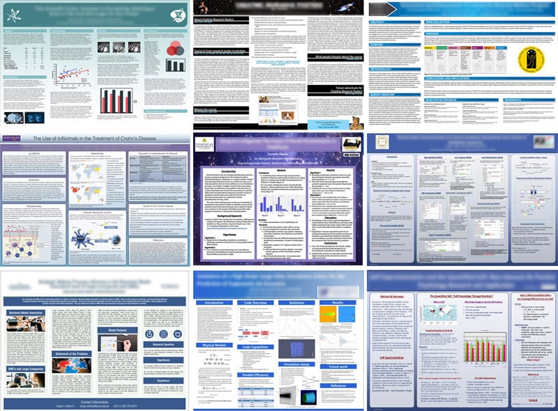
These 9 posters, randomly found online, illustrate the biggest issue with posters. Most posters are walls of text on which authors crammed the equivalent of an entire paper. But that is not how a poster works!
A poster is your storytelling tool, not the whole story. Think about it. If everything is already on the poster, there is no need for you to stand next to it, no? You alone are the storyteller and your poster should have the handy figures and tables to support your message.
But consider also the reader’s perspective for a moment. When you are reading a new paper at your office or at home, you would sit comfortably with some coffee, perhaps with relaxing music in the background, right? In such ideal circumstances it would take you about an hour to read it all. But in the noisy, highly distracting environment of the ARVO poster hall (think people blocking the text while you read, people asking questions to the author, interrupting your line of thought, etc.), you have just a few minutes to accomplish a similar level of understanding. So, it won’t come as a surprise that after the session readers will have forgotten most posters they have seen. Good poster design keeps this distracting environmental context in mind and makes it easy for your audience to grasp your message in a minimum amount of time.
Therefore, before opening your favorite design tool, consider three important aspects: the target audience, the take-home message and the main text.
First, ask yourself who you want to reach with your message of the 12,000 people visiting ARVO. Although it is understandable that you want everyone to see your poster, it will only appeal to a small subgroup. ARVO is a big place with many people trying to catch the reader’s attention, so it is more efficient and rewarding to only aim for those receptive to your work. Your target audience will depend on the kind of result you want to present, which in turn determines the tone and level of detail you need on your poster. Is it a technical result best suited for the 50 or so people working in the same field as you? In that case it is safe to assume that your readers are already familiar with many of the technical aspects. Or is it something with broader appeal that should be shared with a larger audience? Here, it would be better to use more general terms that people outside your field would also be familiar with.
Next, it is time for your take-home message: that one bit of information you want your readers to remember, if nothing else. This should be short and sweet, no longer than 300 characters. The take-home message is no place for the fluffy language some use in their papers, it is your main result as a tweet that will feature prominently on your poster.
Once this is done, you can start with the main poster text by expanding the take-home message. It is good practice to follow the structure of an abstract (Purpose, Methods, Results, Discussion, Conclusion), which is a structure you and your reader are already familiar with. Here are a few tips to keep in mind:
- Above all: short and sweet is the key. No more than about 300-400 words (about 1/2 page).
- Write your main text in a text editor, rather than in your design tool, to keep an eye to the word count.
- The Purpose should be two or three sentences about the background of the project and another one about the immediate goal. Keep it focused on the take-home message.
- In the Methods section, provide only the need-to-know technical information. This is often less than you think.
- For the Results, use tables and figures wherever you can. People are visual beings and will understand these much faster than a dense block of text. Present only information related to your take-home message.
- The Methods, Results and Discussion are best presented as short bullet points.
- The level of the language and terms should be aimed at the level of early doctoral students, and avoid overly technical sentences, to remain accessible.
- Don’t add an abstract to your poster! It doesn’t need one, because it already IS an abstract.
- Stay away from extensive literature reviews in the Purpose or Discussion. These clutter up your poster and distract from your own work.
There may be situations where you may feel that the above structure leaves you little room to give important background information. Although you will be standing next to your poster to explain these things, you could add a few visually distinct information boxes that casual readers can ignore, but more in-depth readers may find interesting. Used sparingly, these add a powerful dimension to your design.
And finally, choose a title that covers your research in as few words as possible (although this must be done at the time of abstract submission since the poster title must match that of the abstract). Your title may be the only thing your readers pay attention to, so make it count!
In the next post we will discuss graphics.
Jos J. Rozema, MSc, PhD

